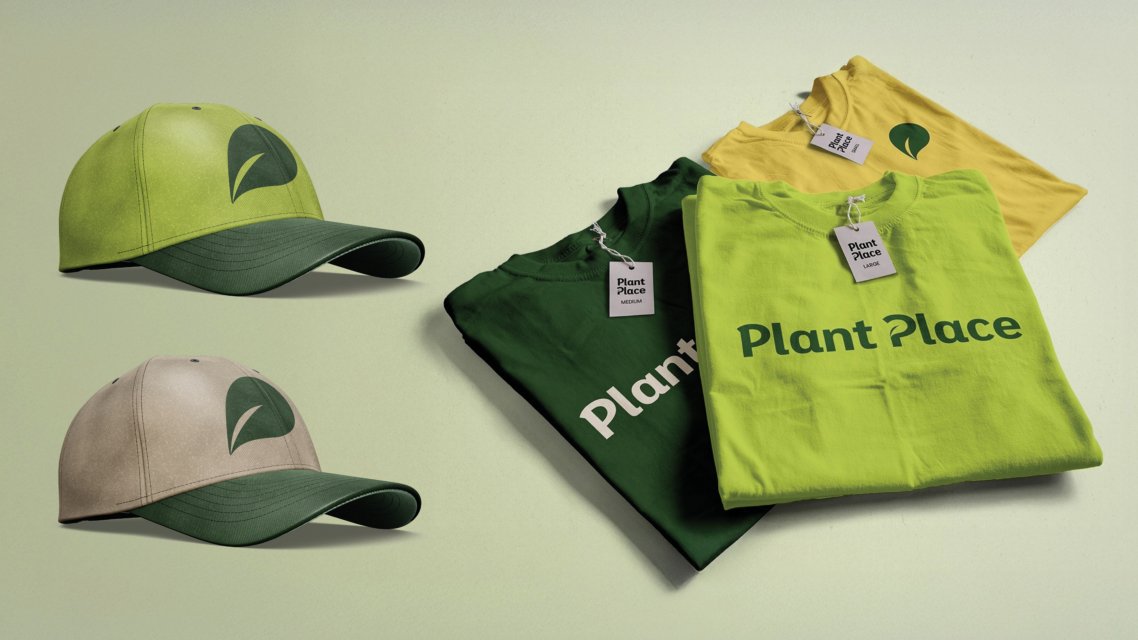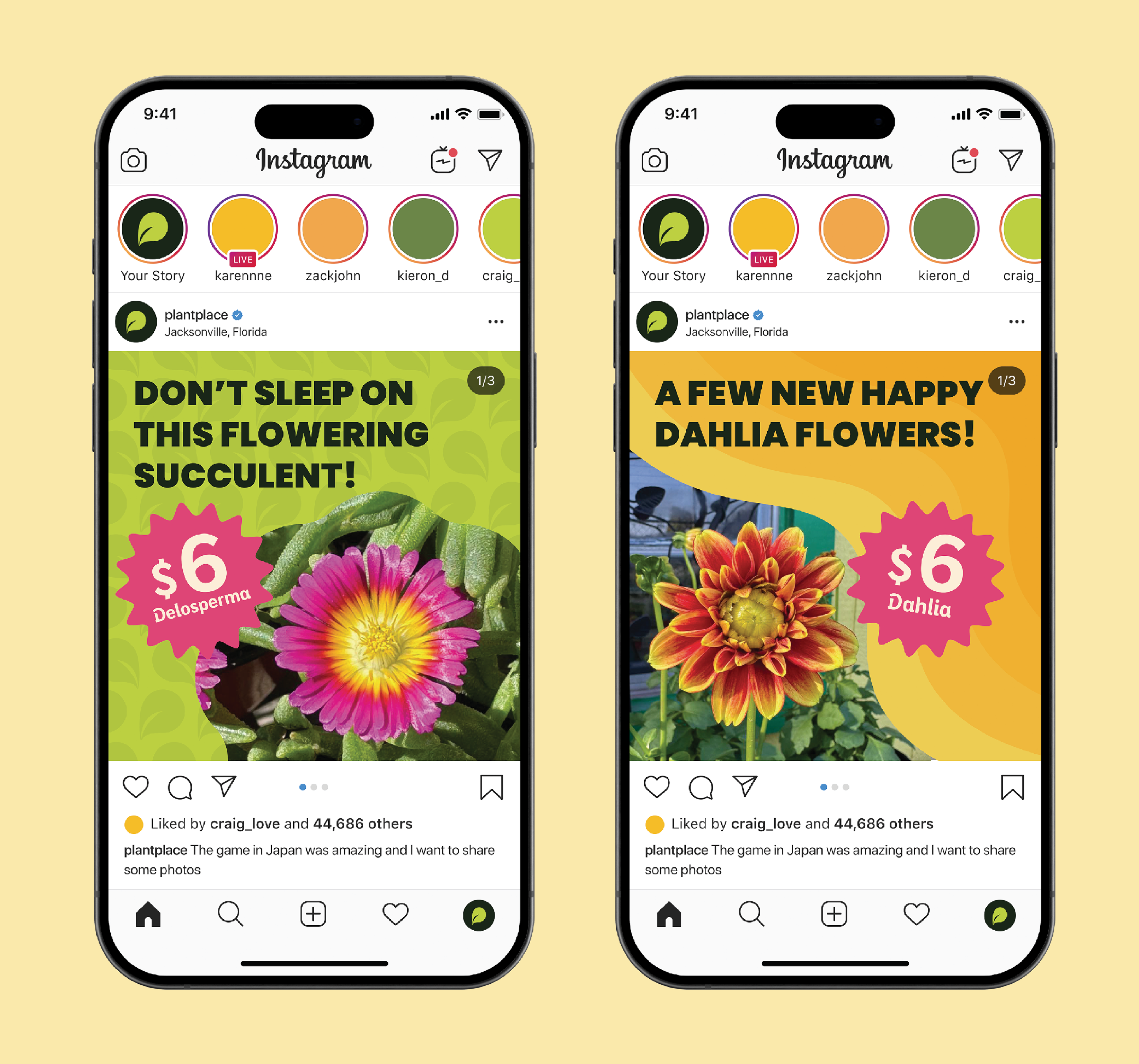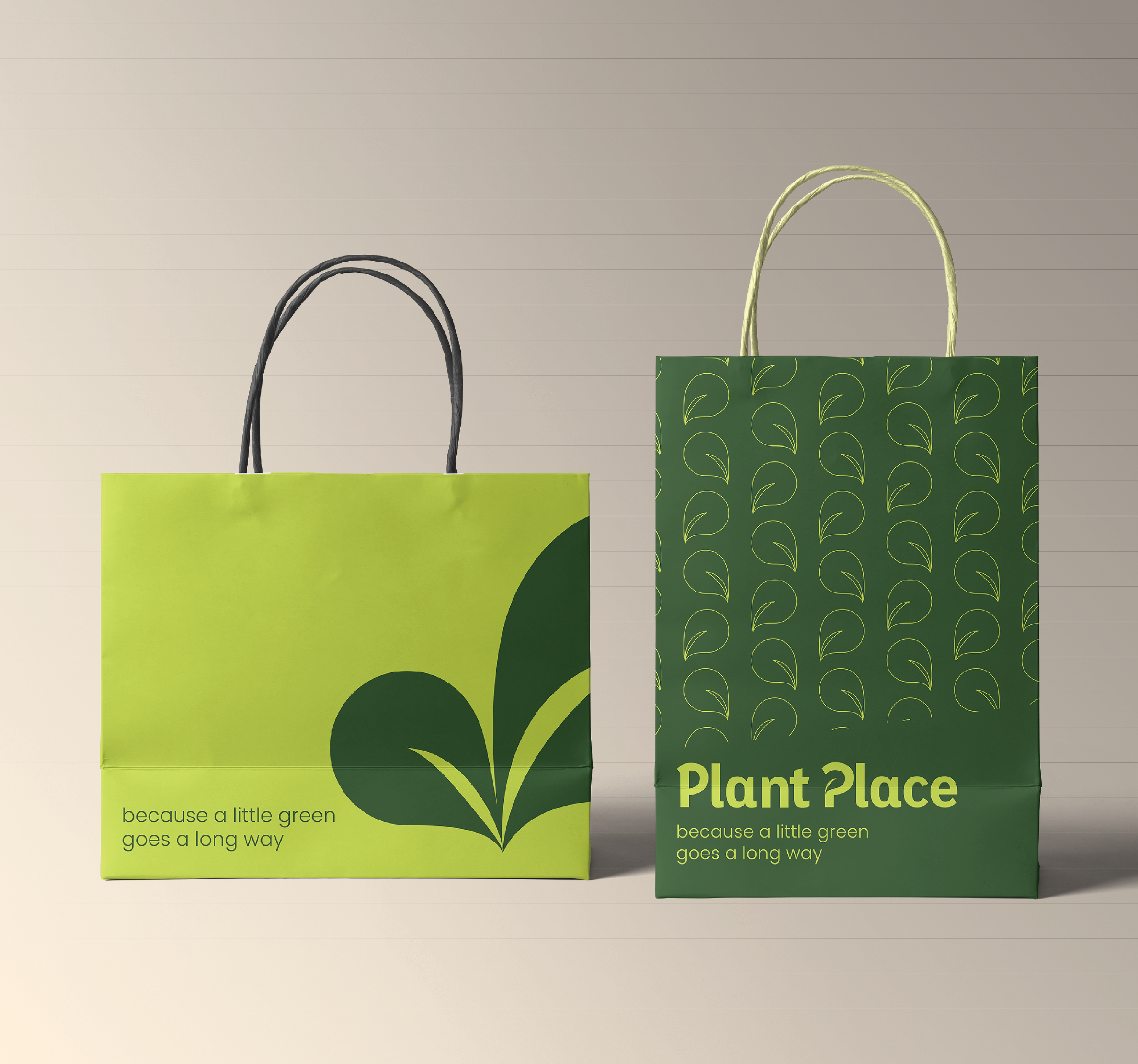
Color Palette
The Plant Place color palette was designed to reflect the brand’s natural roots and friendly personality. Three shades of green create depth, with a bright lime included for strong contrast and readability.
Secondary colors, inspired by the nursery’s floral variety, bring in vibrant accents. These pops of color break away from typical all-green competitors, adding warmth and flexibility to the overall visual identity.
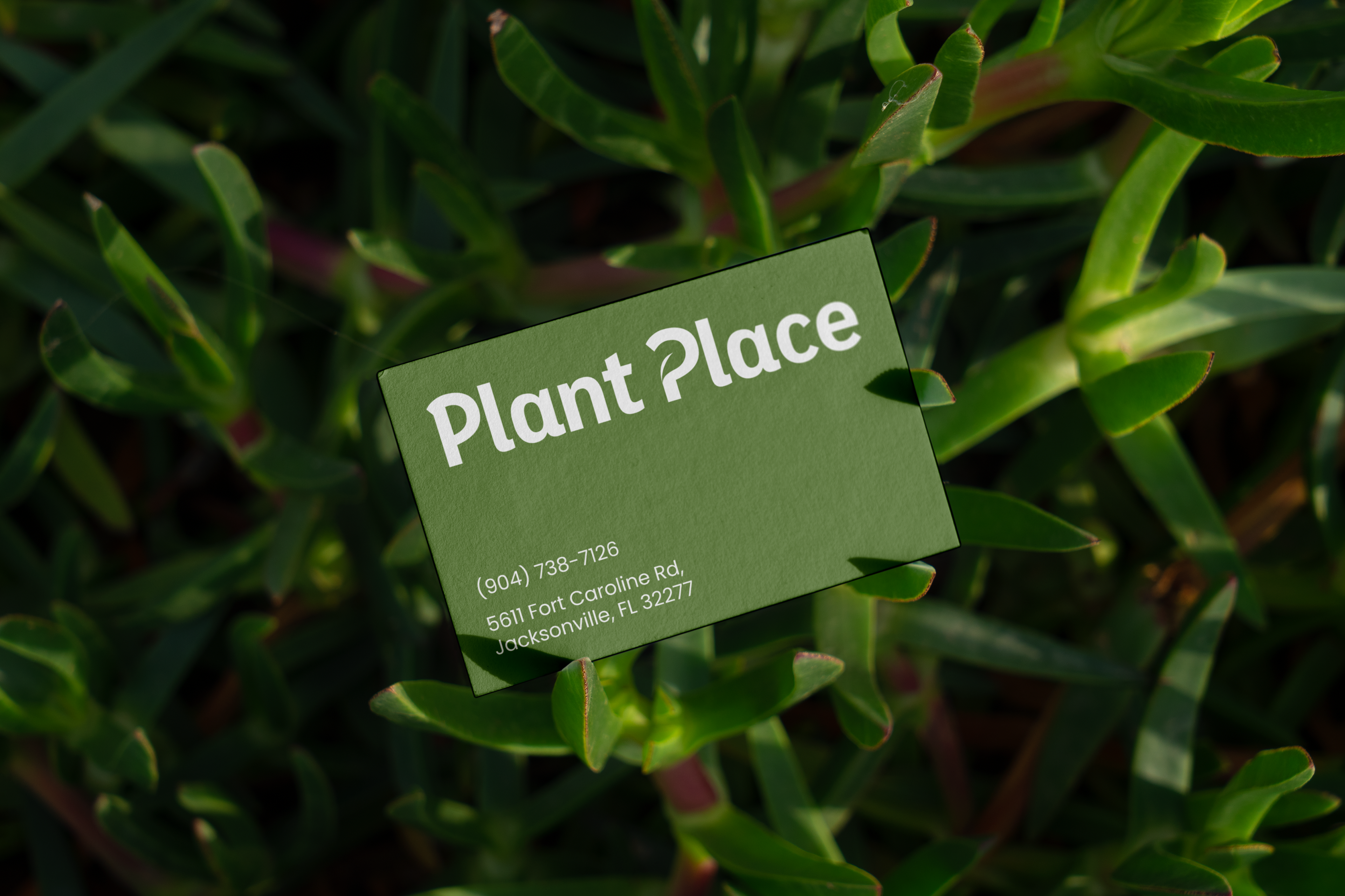
Typography
The primary typeface is Eixample Dip Bold, used in both the wordmark and main headings. Its friendly curves and bold weight help the brand stand out while staying approachable.
Poppins is used as the secondary typeface for body text and supporting headings. Its wide range of weights and clean, rounded forms pair well with the primary type, keeping the overall look cohesive and easy to read.