Color Palette
Each color in the palette was selected to create an energetic, electric feel. When the initial selection leaned too warm, indigo and deep blue were added to provide balance and contrast.
Secondary colors were then introduced to offer greater flexibility for future designs while still harmonizing with the primary palette.
Typography
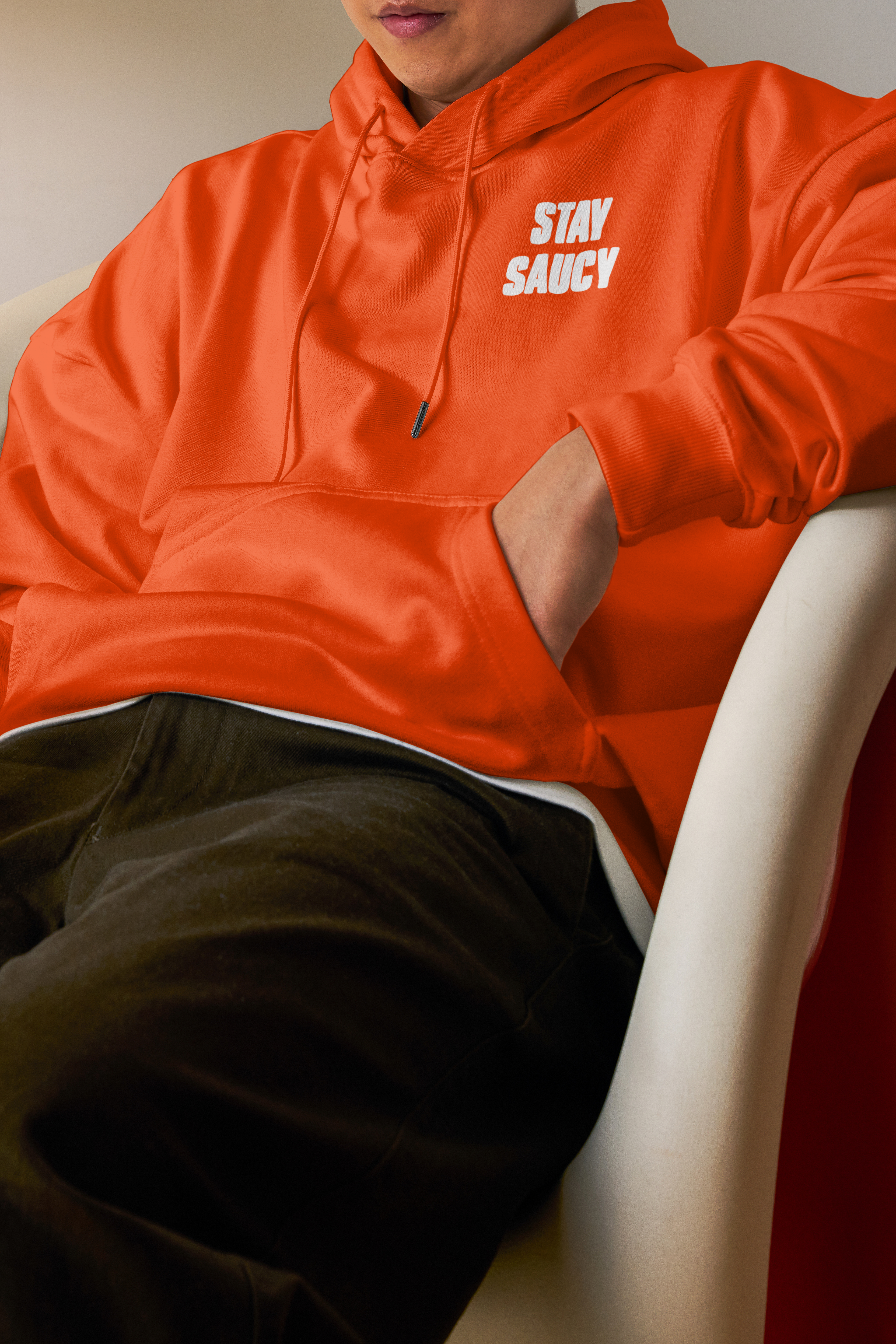
Podium was chosen for headlines due to its bold structure and soft edges, striking a balance that grabs attention without feeling too formal or harsh.
For supporting text, Bebas Neue was selected for its modern aesthetic and versatile font family, offering a range of styles—from condensed to expanded—that maintain visual consistency across various brand applications.