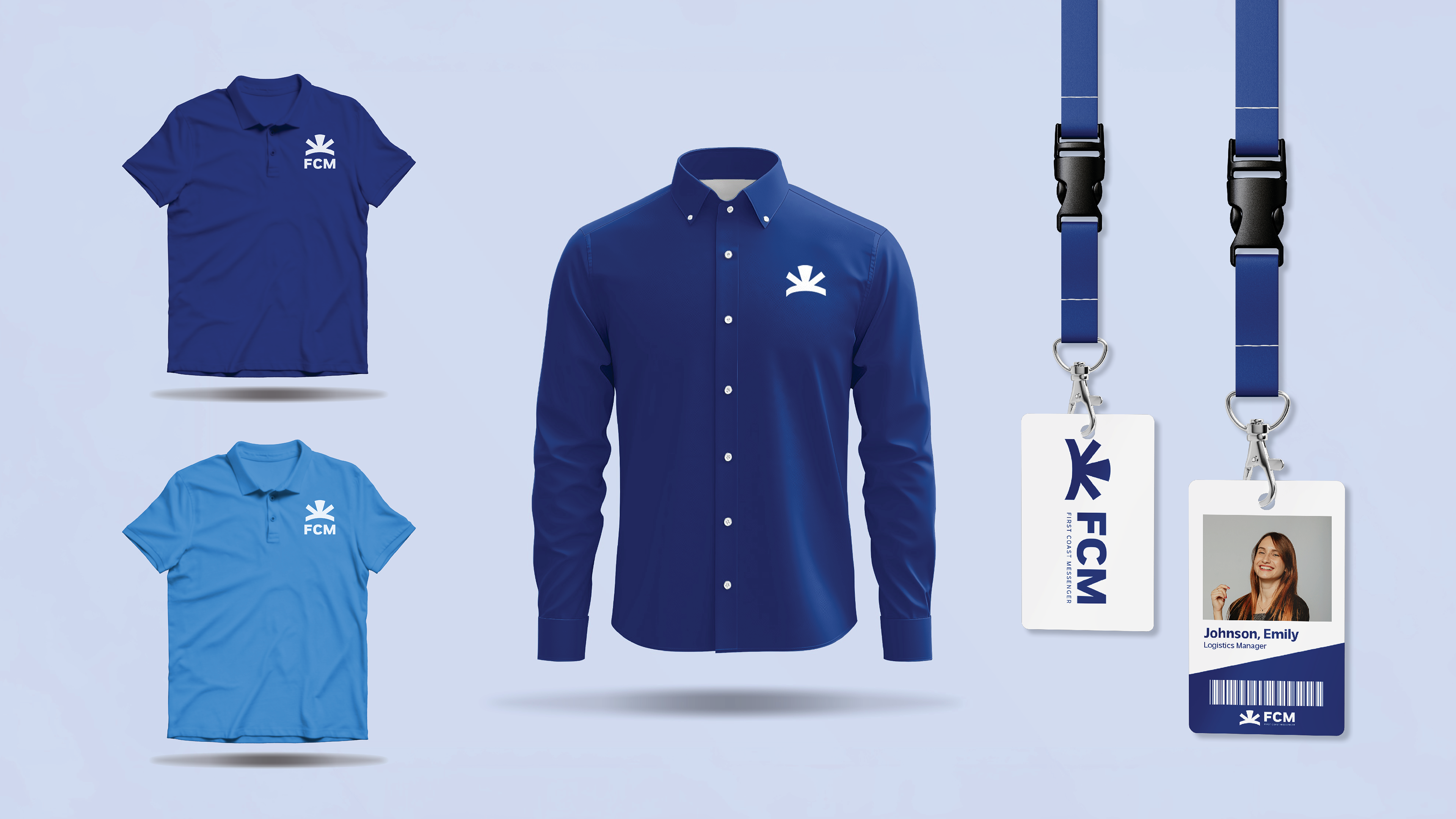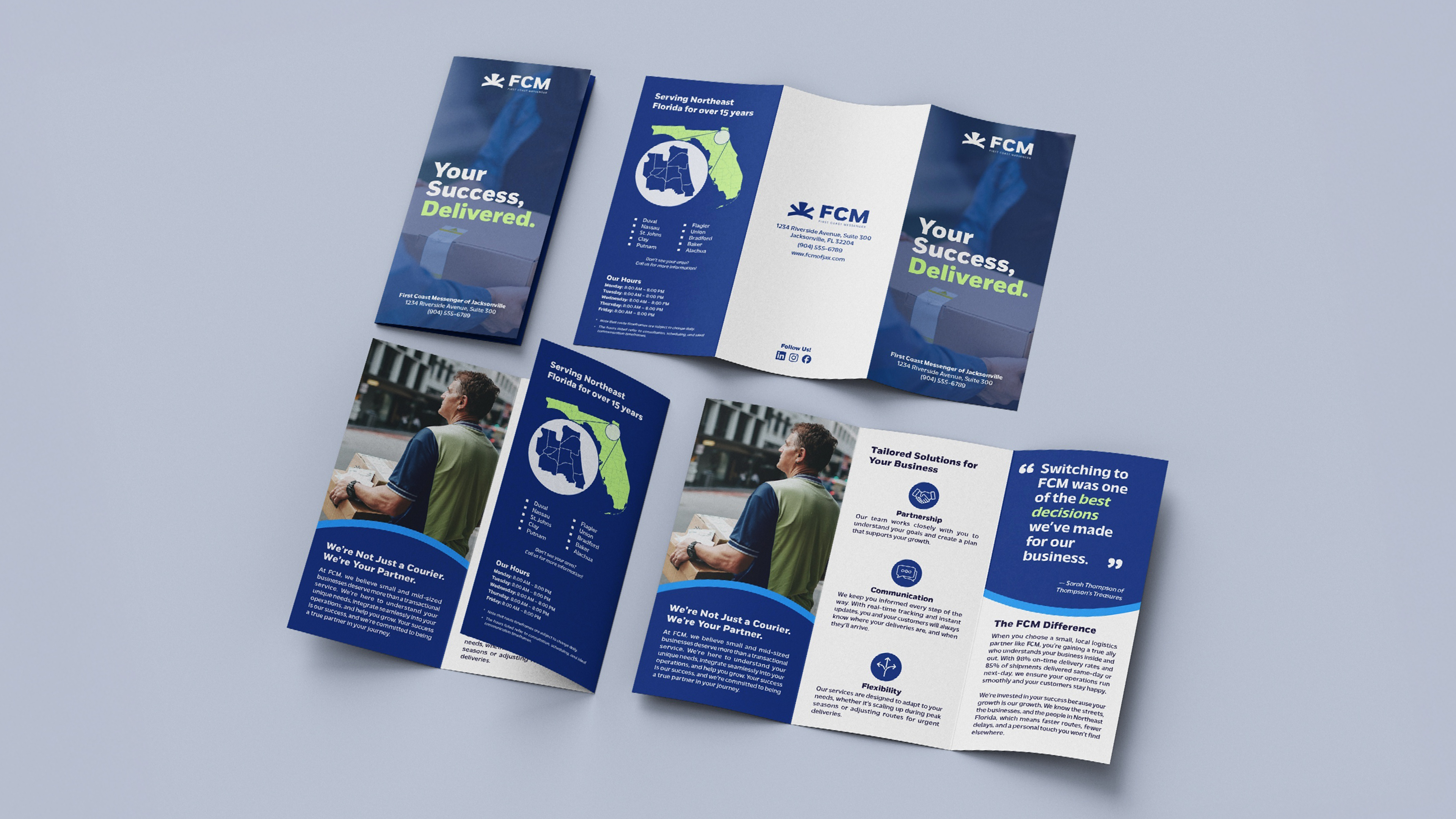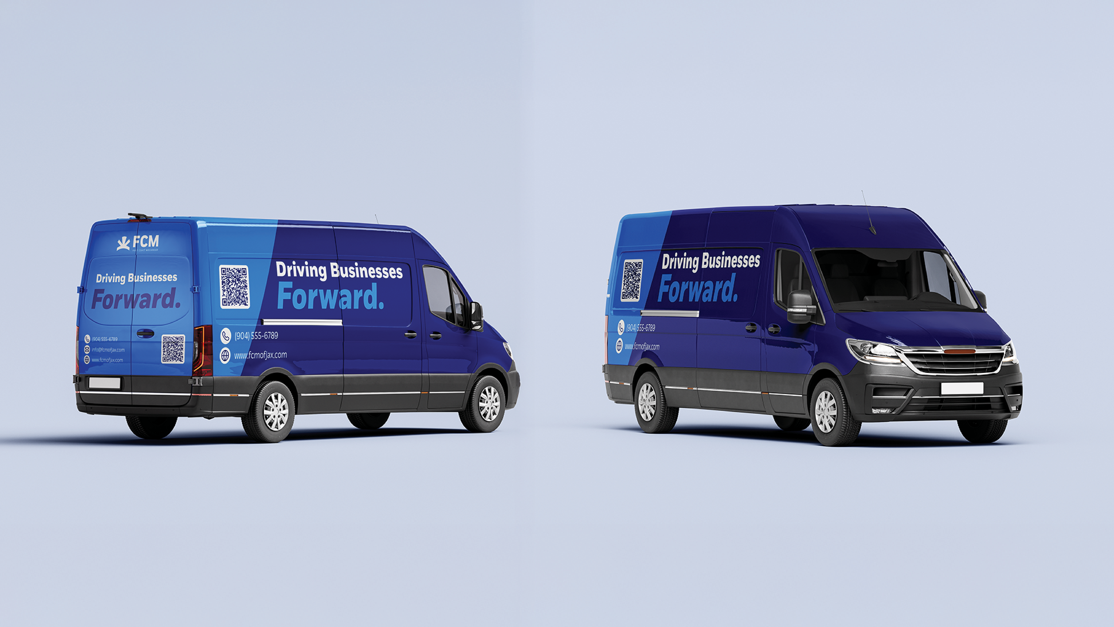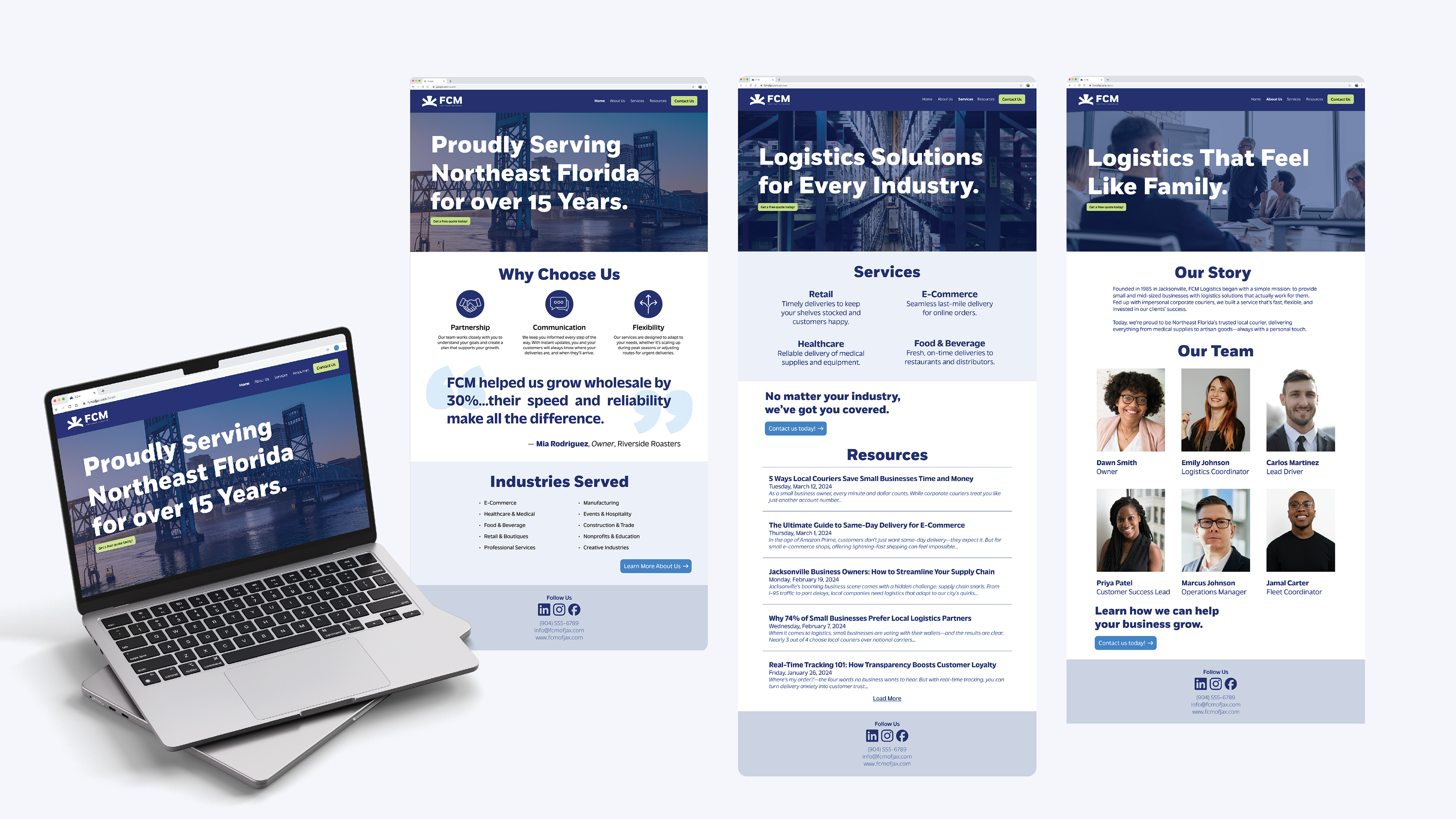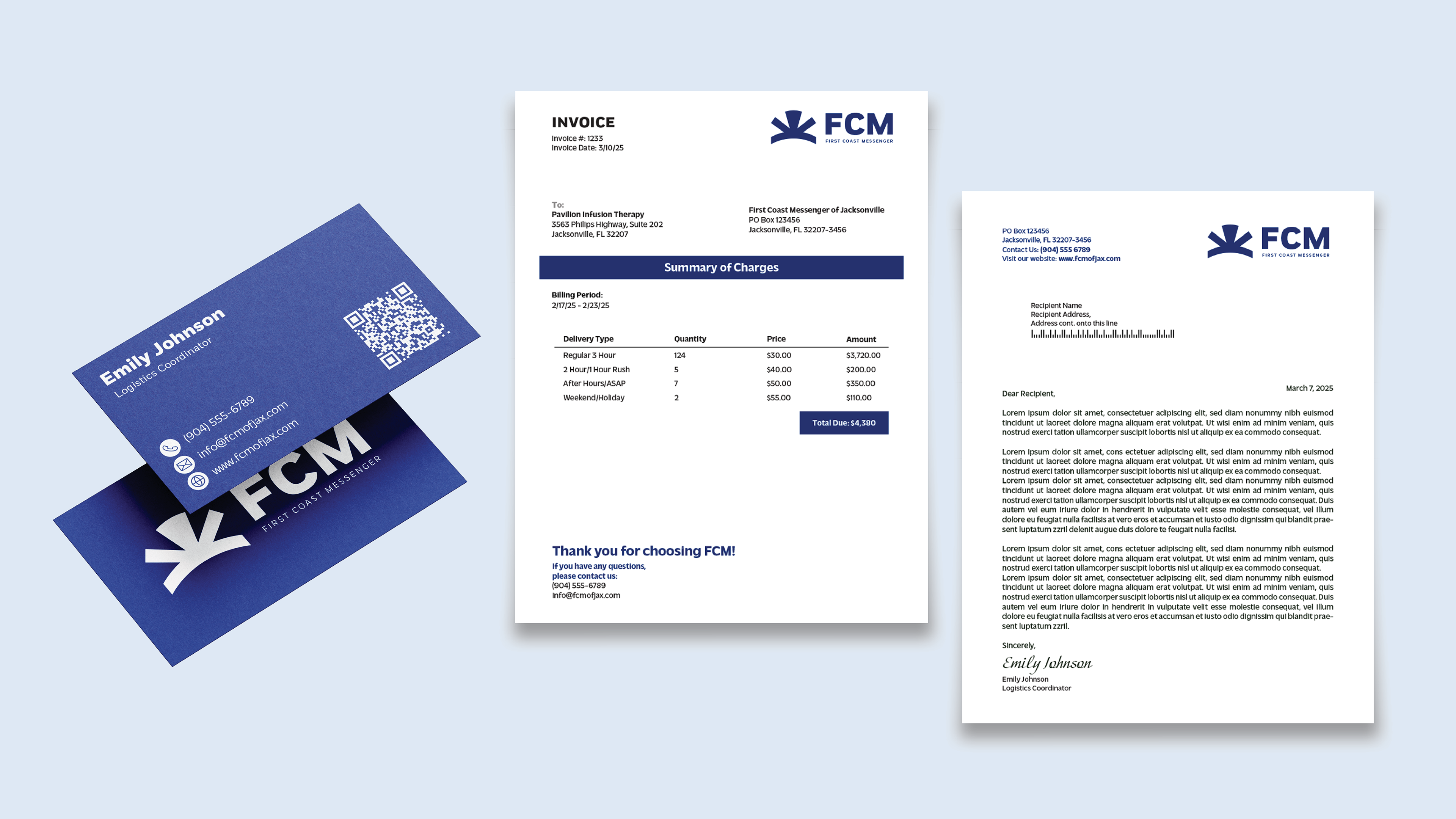
Color Palette
Blue was chosen for its strong association with trust and dependability, providing an immediate sense of reliability. It is paired with green to honor the owners’ favorite hues and to symbolize growth and vitality.
Together, these primary colors establish a meaningful foundation for the brand’s visual identity. Secondary colors were then introduced to expand the palette, offering designers flexibility for accents and varied contexts—from digital interfaces to printed materials—while maintaining cohesion with the core brand look.
Typography
Fort was selected for the acronym portion of the wordmark because its bold, sturdy letterforms convey strength and reliability and remain highly legible in motion applications like vehicle wraps or billboards.
Massilia complements Fort’s practicality and readability with a warmer, more expressive character that underscores the brand’s focus on connection and service.