FCM
FCM built its reputation by perfectly blending into their client's workflow. Then blended so well, their brand got lost.

Services
Branding Strategy
Visual Identity
Verbal Identity
Overview
First Coast Messenger has been a proud partner of Jacksonville's medical network for over 20 years, serving as the reliable partner that moves critical supplies between hospitals, delivers medications to homebound patients, and lets healthcare professionals focus on what matters most.
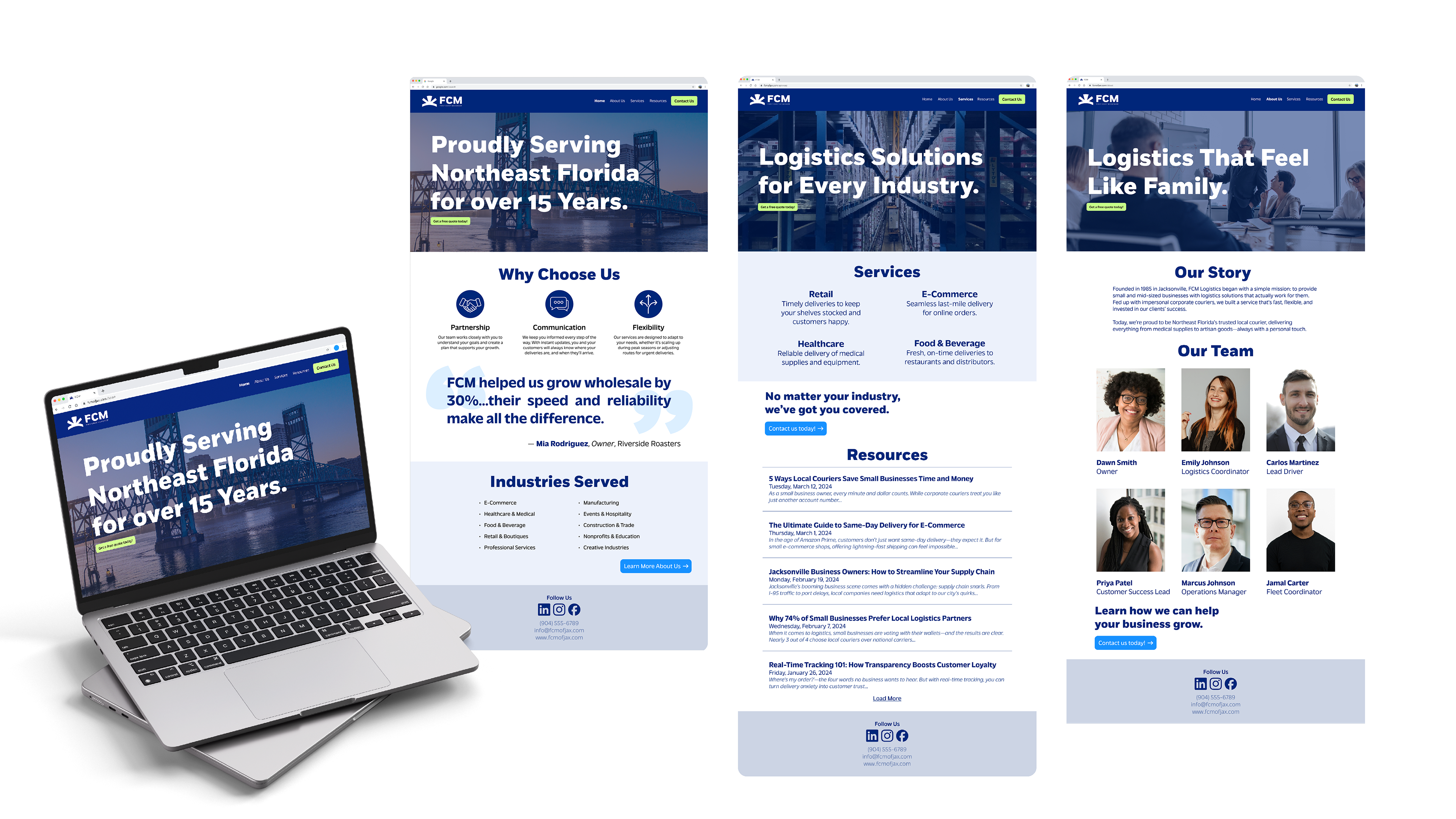
FCM’s ability to provide communication and flexibility to solve problems most patients and providers don’t see coming has contributed to their brand’s own challenge. By integrating so well with partners' operations, FCM's own identity faded into the background.
Brand Strategy
My discovery process revealed a core issue: FCM’s exceptional service had made them vital to their client’s community, but invisible as a standalone brand. They were perceived as an internal team rather than a specialized partner and they operated in a local courier landscape dominated by impersonal transactions.
But, this also revealed their greatest opportunity to fill a clear market gap for a truly human-centric service.
The next steps were getting to know the brand's attributes, future goals, and more about their personal mission without considering their current clients. This revealed a desire to be seen as a partner invested in their clients' success, not just a task-completing vendor. That statement became the north star for the entire identity.
Visual Strategy
Color Palette
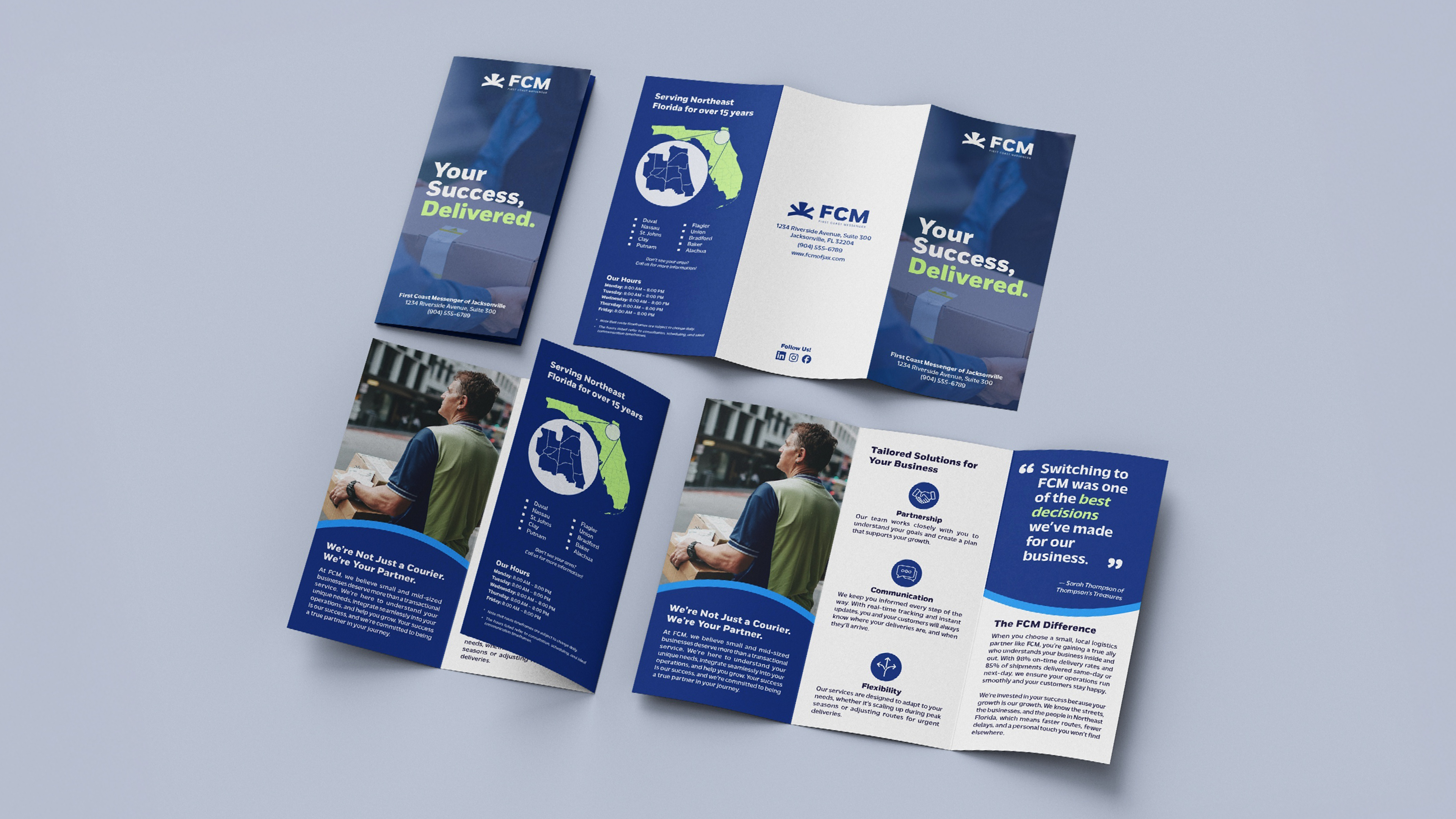
Blue was chosen for its strong association with trust and dependability, providing an immediate sense of reliability. It is paired with green to honor the owners’ favorite hues and to symbolize growth and vitality.
Together, these primary colors establish a meaningful foundation for the brand’s visual identity. Secondary colors were then introduced to expand the palette, offering designers flexibility for accents and varied contexts—from digital interfaces to printed materials—while maintaining cohesion with the core brand look.
Typography
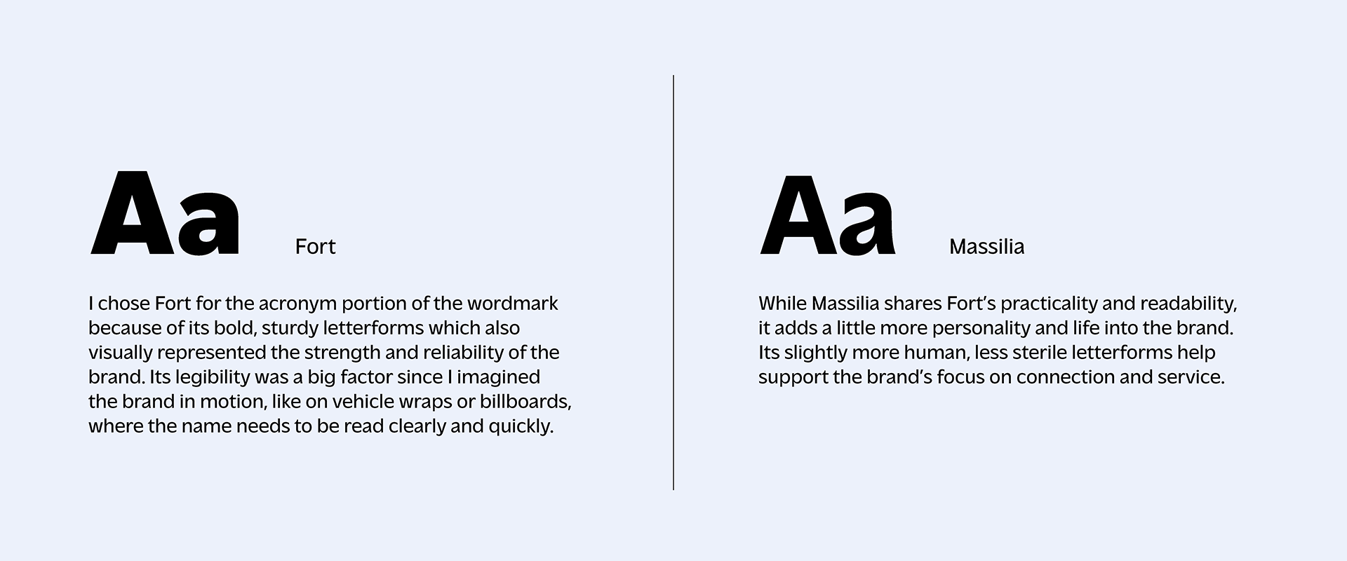
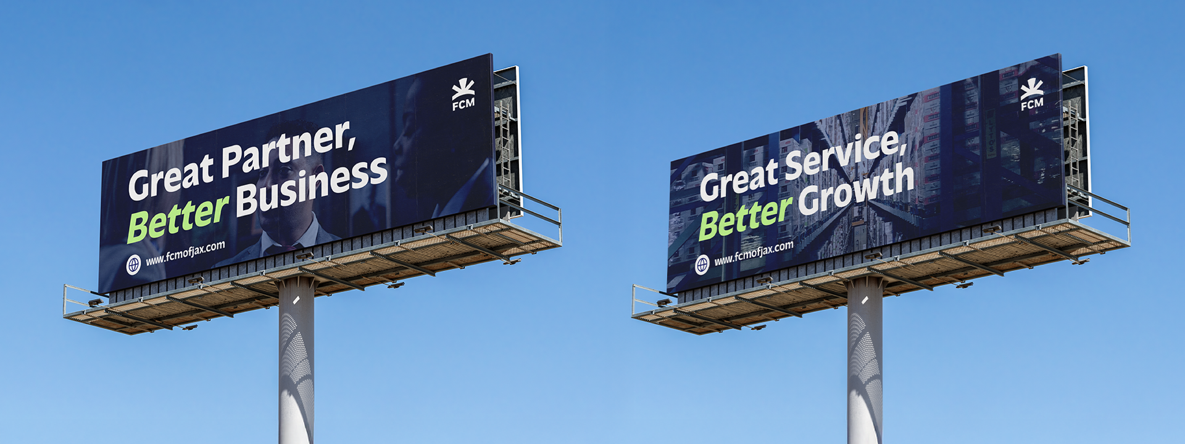
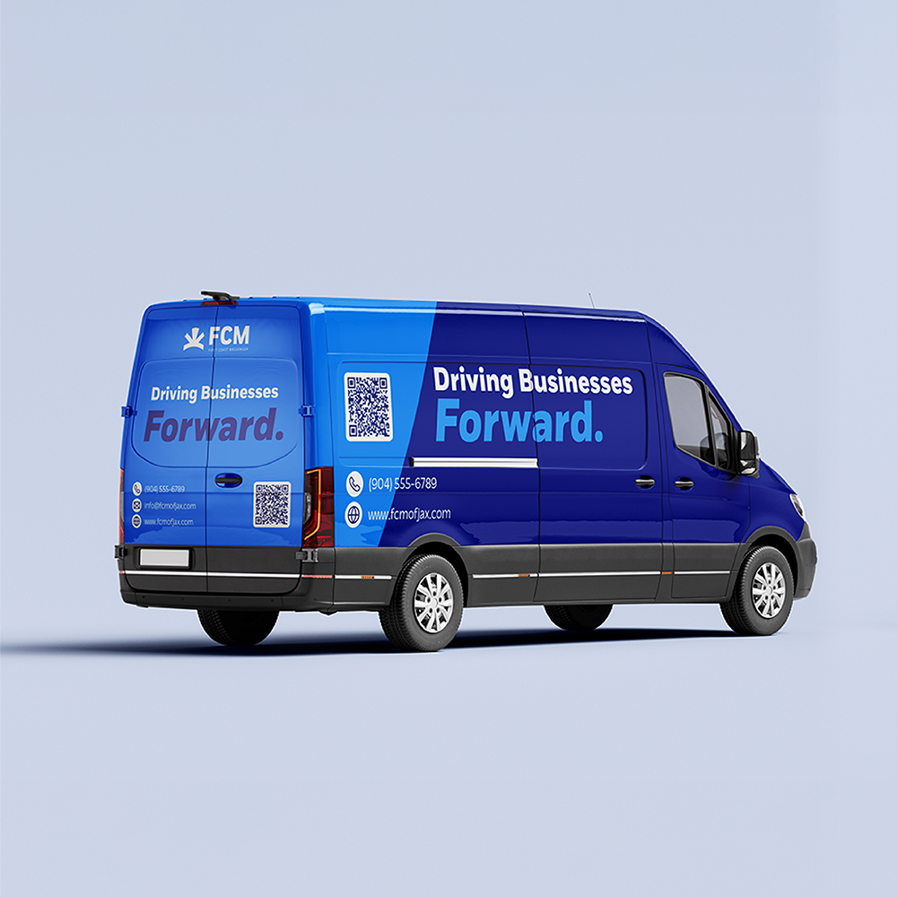
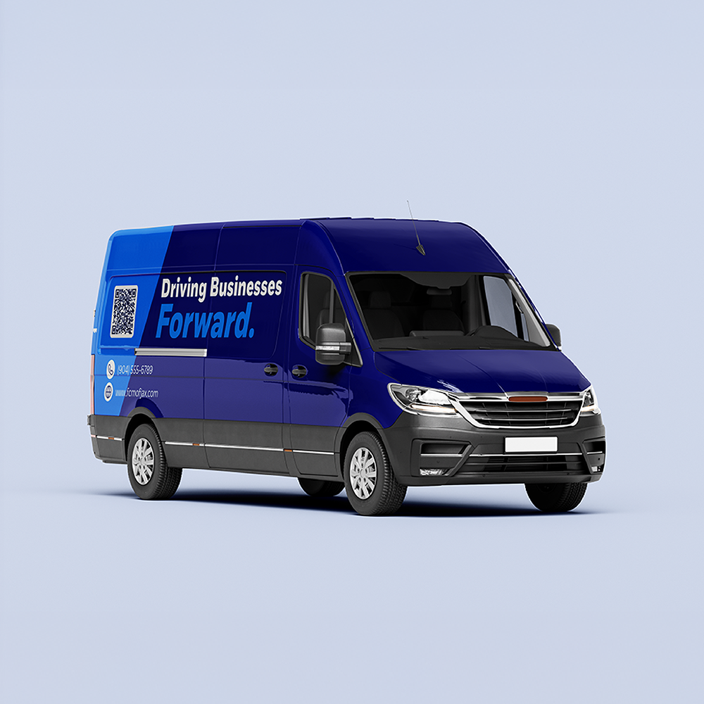
Fort was selected for the acronym portion of the wordmark because its bold, sturdy letterforms convey strength and reliability and remain highly legible in motion applications like vehicle wraps or billboards.
Massilia complements Fort’s practicality and readability with a warmer, more expressive character that underscores the brand’s focus on connection and service.